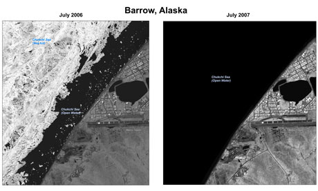
Often, the trigger for that "my brain is full" feeling is an article that seriously pisses me off. Here's the one that did it today: Now if you click over to the article I have linked toward the end, you can see a much larger version; I'm just linking the thumbnail. (But please read the rant between here and there to understand why you should not take this pair of pictures alone too seriously) The angry is not coming from what you might think; the two side-by-side photos are of the same place at the same time of year (July). The left one is earlier (06), and the right one later (o7). Do you see why I don't grant a whole lot of importance to these two images by themselves? Climate change is a terribly noisy phenomenon: you should expect a great deal of year-to-year variation. This is a fundamental ploy of the deniers: to cherry-pick places and times that show changes different from what you might expect. The problem is, climate scientists do expect such contradictory changes. They just can't predict when and where they'll occur. It's that denialist ploy that I was lampooning in this post:
 No, what you need to do is gather lots and lots and lots of data as widely and as closely spaced as you can, and look for long term trends. Picking two close points in time, and connecting them with a red arrow (as I did with that graph- source material here) and claiming that that trend indicates we're headed into an ice age is really sort of asinine, right? What you really want to look at is that blue line. Another way of putting this is to ask yourself the question, if the two photos above were reversed- clear in 06, icy in 07, but the graph above reflected that reality, would the graph convince you the trend was up? Take a moment to visualize it (If anyone requests it, I will redo the graph to reflect a switching of the 06/07 points, but I hope most of you can just glance and see. The 07 point is the lower left end of the facetious red arrow; 06 is the next point a little higher to the left. Basically, the fall in ice coverage would be steeper from 05 to 06, and the rise 07 to 08 woud be a little shallower.)
 Now if you click over to the article I have linked toward the end, you can see a much larger version; I'm just linking the thumbnail. (But please read the rant between here and there to understand why you should not take this pair of pictures alone too seriously) The angry is not coming from what you might think; the two side-by-side photos are of the same place at the same time of year (July). The left one is earlier (06), and the right one later (o7). Do you see why I don't grant a whole lot of importance to these two images by themselves? Climate change is a terribly noisy phenomenon: you should expect a great deal of year-to-year variation. This is a fundamental ploy of the deniers: to cherry-pick places and times that show changes different from what you might expect. The problem is, climate scientists do expect such contradictory changes. They just can't predict when and where they'll occur. It's that denialist ploy that I was lampooning in this post:
 No, what you need to do is gather lots and lots and lots of data as widely and as closely spaced as you can, and look for long term trends. Picking two close points in time, and connecting them with a red arrow (as I did with that graph- source material here) and claiming that that trend indicates we're headed into an ice age is really sort of asinine, right? What you really want to look at is that blue line. Another way of putting this is to ask yourself the question, if the two photos above were reversed- clear in 06, icy in 07, but the graph above reflected that reality, would the graph convince you the trend was up? Take a moment to visualize it (If anyone requests it, I will redo the graph to reflect a switching of the 06/07 points, but I hope most of you can just glance and see. The 07 point is the lower left end of the facetious red arrow; 06 is the next point a little higher to the left. Basically, the fall in ice coverage would be steeper from 05 to 06, and the rise 07 to 08 woud be a little shallower.)
The point is, while the differences between those two years is stark and startling, in the context of the long term trend, those images alone don't mean much.
So why, exactly, am I wasting time and virtual ink ranting about this?
Remember I just said that you need lots of data, over wide areas and with high resolution? Well, the source of the top pair of pictures, The Guardian, is basically claiming that BushCo purposely withheld data that's badly needed by climate scientists. I haven't look for the archive yet, but there are 1000 high-resolution images like the two above that have just been released by the Obama administration.
The pictures, kept secret by Washington during the presidency of George W Bush, were declassified by the White House last week. President Barack Obama is currently trying to galvanise Congress and the American public to take action to halt catastrophic climate change caused by rising levels of carbon dioxide in the atmosphere.(...)
The photographs demonstrate starkly how global warming is changing the Arctic. More than a million square kilometres of sea ice - a record loss - were missing in the summer of 2007 compared with the previous year.Now, in fairness, The Guardian does not lay out sufficient evidence to convince me of the claim they leap to in their headline, "Revealed: the secret evidence of global warming Bush tried to hide." However, they do point out that environmental agencies have been howling for years that they don't have funds and resources to aquire the data they need. I suppose, as the shrub was earnestly telling us we needed more research and more studies and more careful thought, that in his reflexive classification of any data at all, the utility of photos like the above might have escaped his attention. And given his mentality, I'm sure that the idea that data, you know, might be of any use to scientists concerned that we might be headed into one of the greatest extinction events in earth's history. So maybe there really wasn't purposeful, malicious intent.
Nor has this loss shown any sign of recovery. Ice cover for 2008 was almost as bad as for 2007, and this year levels look equally sparse.
"These are one-metre resolution images, which give you a big picture of the summertime Arctic," said Thorsten Markus of Nasa's Goddard Space Flight Centre. "This is the main reason why we are so thrilled about it. One-metre resolution is the dimension that's been missing."
I don't give a damn.
I want that motherfucker and his cronies up on mass murder, reckless destruction of property, dereliction of duty, and any number of other charges, and I want it yesterday... no, make that eight years ago. There would still be enough time to avert 9/11 if we had had someone with any interest in doing so in charge.
When the trial is over, fly him to Alaska, put him in a parka and a nice warm pair of snow pants. Set him on a nice little chunk of floe ice, I'm thinking roughly 50 square meters and a meter thick, shackle his feet, and cuff his hands behind his back.
And push him out to sea.
I'm going home. My brain is full.


 Slide # 23,753 -- Sept. 3, 1986 -- ©Robert A. Jensen (


