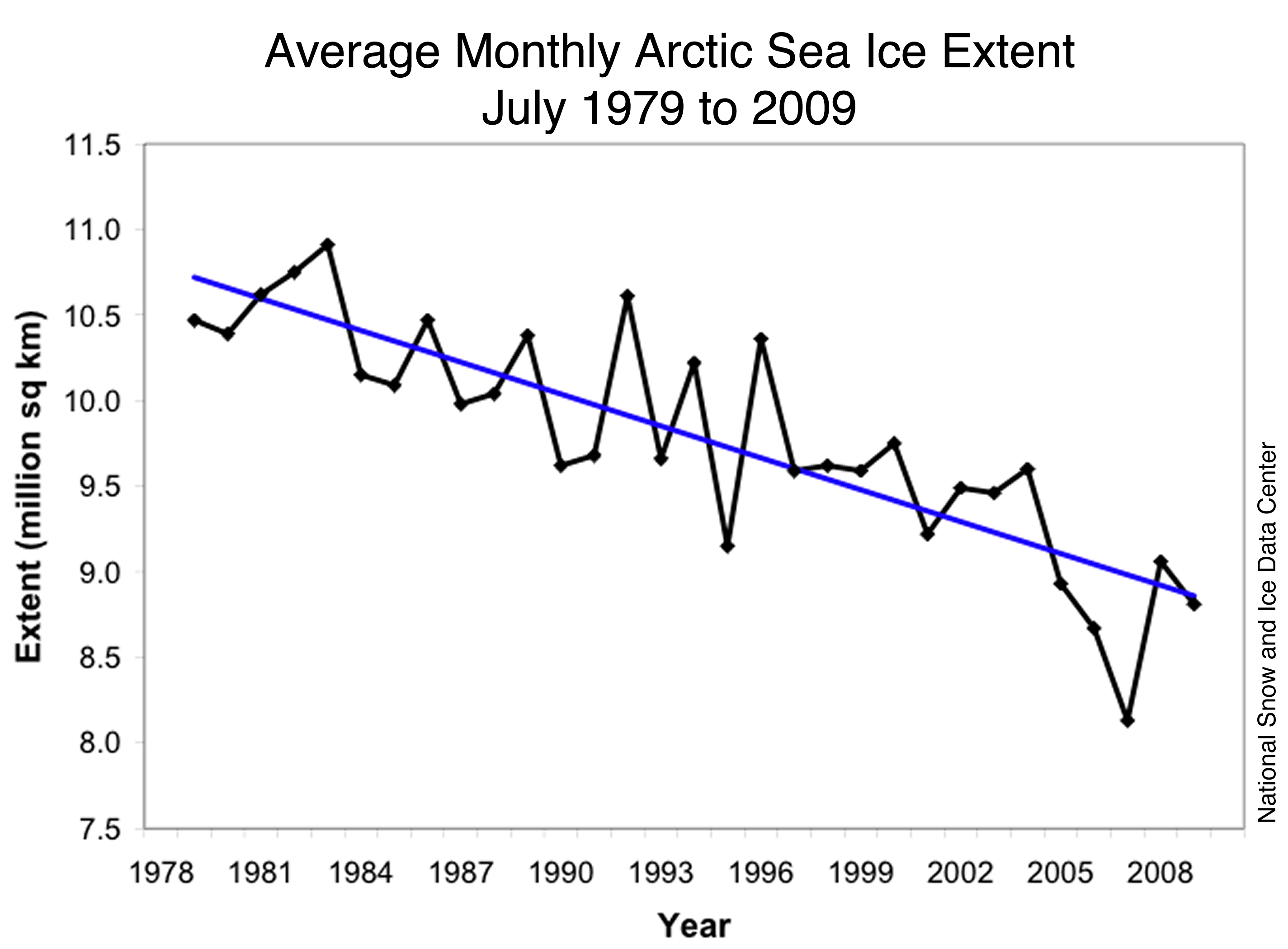
 Funny how the same data set, with some shifts, flips, and re-coloring can represent so many different things.


Is This Your Hat?
11 years ago
Funny how the same data set, with some shifts, flips, and re-coloring can represent so many different things.


1 comment:
Hmmm. That chart is missing pirates and their contribution to climate change.
Post a Comment